Wednesday, November 18, 2009

Animation Experimentation


These animations were made throughout the project as I was experimented with colour, style etc.

Colour Experimantation


These images were done in Photoshop, and were another attempt to see if there was a better colour to use other than red. Most of the colours seem to work well, such as purple and green. Colours such as brown and orange seem to not work so well. The reason why red works so well, is that it almost looks organic in a way, kind of like the insides of a creature. Red is definately the best option, as it allows for a better atmospher, and connotes a lot more emotion. Red can mean love, death and evil and lots more emotions and feelings that all contrast eachother.

Final Design and Story


Story: Before the land was cultivated by the creatures that came before us, there was an organism of much tragedy and loneliness. In this sick and twisted land, disability is considered the sign of Devilry. Anything that could not function like the majority was cast into an infernal pit.
The protagonist is a disabled skeleton who was hunted for this reason. Covered in a cloak to hide his shame, the protagonist attempts to flee his oppressors. He is eventually captured and thrown into the infernal pit, where a strange, liquid black and white monster desperately struggles to devour his existence.


This image was drawn using Microsoft Paint, and indicates the final animation. I have chosen to use red, as it is most probable I will use this colour. The background is related to the story. I decided to keep the black and white in the foreground and use the red for the background, allmost creating a kind of focal difference. I looked at a lot of art and images relating to Hell, to get a kind of twisted look.

I was also inspired by this song, which I listened to whilst drawing it. http://www.youtube.com/watch?v=sdAMtTi39g8

Colour Tests


These are some experimentation I did with colour. A small animation was made of my character against different colour backgrounds. The green and Blue colours do not seem to go as well with the simple greyscale look I wanted to do. The red actually works really well, so I might end up using red.

El Topo's Inspiration on Design


Alexandro Jodorowsky is one of my favourite film makers, and his film 'El Topo' is one of my favourite films. El Topo contains a near infinate amount of topics that it covers, but it tackles one topic better than any other portrayal. Disability is shown in the film, realistically with no signs of trying to dumb it down for the audience. This is done in a powerfull way that eventually shows many disabled people being brutally killed. This controversial power inspired my character design. This is why I chose to give my character no arms.

Idea


After lots of different ideas, I decided to use this simple one. When you click on the character, it reveals that it is actually a skeleton. I chose this idea, as I didn't want to over complicate things in my first project. Mastering the basics is a smarter move than trying something more comlpex. This is a simple animation that shows how the interactivity in my animation will work. The animation was made in the opposite way to what my actual idea is, so I can experiemnt with the idea.

Practise Walk Cycle


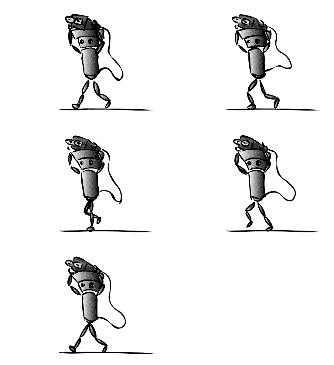
This walk cycle was an attempt at aniamtating a video games character called Chibi-Robo. The legs seem fine but there are some major problems with it. There needs to be some kind of bobbing motion with the torso to give the character a more realistic walk. ALso the wire is completely wrong, as I was just adding it in and not concentrating. Overall I am happy with this animation as the metallic gradient adds something special.